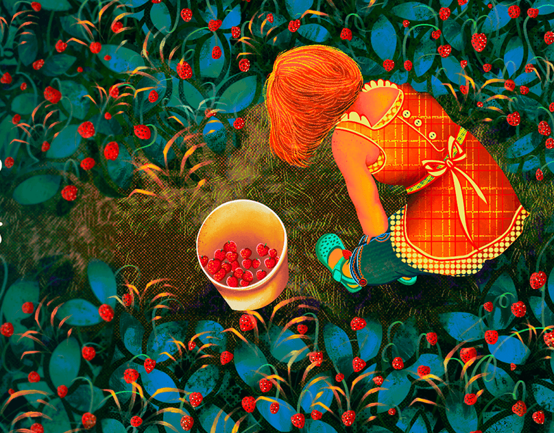
The exhibition's identity, dedicated to the works of the artist Michael Haddad. This is an improvised non-commercial project, which together with Anastasia we created inspired by the laconism of the artist's works,
and decided to translate it into design and show how an exhibition dedicated to this style could look like.


Initially, it was easier to choose the direction of style on the example of posters, so we started
developing an identity from that.
We reviewed most of the author's works, selecting the most liked ones step by step. Then we studied
the styles of various art museums, designs of book covers and magazines related to this subject.
As a result, we formed two mood boards - one with selected works, the other with the most
successful examples of design.
In this way we were able to create a series of 3 posters, which have a different way of "construction", but nevertheless excellent general trends in the arrangement of some elements, which together with the color, typography and paintings create a unified style and play for recognition.

Naturally, attractive posters on the street today are not enough, as we miss opportunities to introduce potential visitors to the exhibition in more detail, as well as attract other members of the target audience.
A great alternative (or addition) to the landing page - a properly designed profile in social networks.
When designing the profile, we aimed to attract and interest a potential visitor (posts created on the basis of posters and informative posts), to engage (post with a contest) and motivate to come as soon as possible.
Obviously, in this case, the content part of the posts would have played just as big a role, but we decided to focus on the design, just assuming what content would work well.


Thinking about the identity, we also decided to make a convenient and intuitive navigation. The icons were designed by Anastasia. We assumed that the exhibition hall may not have its own style, but at the same time be large enough. And, accordingly, we would need navigation to make it easier to navigate, especially considering that the exhibition lasts more than one month.

And finally, a few small elements of identity.
We also created a concept of improvised coffee house as an addition to the exhibition hall, and here is an example of how adaptive identity is easily transferred to any surface and does not need strict rules and frameworks.

Design and creative direction: Arseni Pilipchuk
Design: Anastasija Butkievič
Arts: Mike Haddad
We are open to new projects, just fill out a short form or email me at dsgn.pili@gmail.com
We also collaborate with agencies and designers, you can send us briefs dsgn.pili@gmail.com


